Getting Started
·
6 min
read
Introduction to design tokens
Learn about what design tokens are and how they can help you scale your branding with confidence.
Whether you're a designer, a developer, a manager or a curious executive wanting to scale your organisation's branding with consistency: this post is for you.
After reading this post, you'll have a clear idea of what design tokens are and how they can help your organisation manage its branding at scale.
However, this article focuses on the why's and the what's of design tokens. I won't share with you how to create, name, transform or distribute them within your design system. These subjects deserve their own article.
Ready? Let's dive in 🤿
The underlying business issue
To present you what design tokens are I will emphasise first on the business issue they solve.
All organisations in the world share one thing in common: they have a branding. This branding allows them to communicate and differentiate from one to another. To make a long story short, your organisation's branding is the backbone of its communication.
In the past, when print was king, a branding was defined in a graphical charter. Nowadays, this set of graphical rules has evolved to take into account the myriad of screens surrounding us. Your branding must be applied consistently everywhere, whatever the channel you're communicating on. Design systems are the logical evolution of graphical charters. They help everyone involved in the creation, maintain and usage of a branding work together.
Your branding is part of the trust your audience has in your organisation. Cherish it to keep your audience with you.
How would you react if you received an email from your bank with an outdated logo? How would you feel if your bank website and mobile application didn't share the same branding? What would you think at night with a full light mode interface burning your tiny eyes?
Let me tell you a story. It's about a simple rebranding of the ACME organisation. We will be in the shoes of a designer trying to apply a design decision at scale.
That's it. You're the new Head of Design at ACME Corp. You're excited and can't wait to start the rebranding you've been hired for. This rebranding consists in replacing the main color of your organisation by a new one. One single color replacement.
Some time goes by and you're finally satisfied with the new branding. It "just" has to be applied in every interface of every product your organisation provides.
Unfortunately for you, your organisation has many interfaces and many platforms to maintain:
A marketing website
A web application
An Android application
An iOS application
You are brave and determined to fulfill your mission. You decide to personally ask every manager of every engineering team to update the color in their codebase with the new value you chose.
You open Slack and start writing:
You think this will be a no brainer. Spoiler alert: you're wrong.
Steve, the manager in charge of the web platform answers and the conversation looks like this:
Steve: Thanks for the new color value. Do you have the HEX value?
You: This is
#EDC840. I think so... 😬Steve: Are you sure? I'm not really confident about this and have a lot of work to do.
And you didn't even receive the answer from the managers of the Android and iOS teams. And by the way, as you may have guessed, these platforms handle color in different formats.
You start to realise that something is broken between you and the developers you're working with. Communicating design decisions and making sure they are correctly applied is a tedious task. In other words, your organisation doesn't have a "design language" designers and developers can use.
We are human beings. Not machines. Absolute values like a RGB or a HEX color code don't speak for themselves.
To emphasise this, let's butcher this famous quote:
Applying a new color on several platforms shouldn't take months...
In 2015, Spotify was rebranded and by extension updated its brand guidelines. It took them several months to propagate the new green color to all of their platforms. Now, thanks to their design system foundation based on design tokens, it would take them only several minutes.

Design tokens are the foundations of Spotify's design system — Encore.
And updating a typeface across many websites shouldn't cost millions
Matthew Ström is a designer who previously worked at the Wall Street Journal. They had to update the typeface on the main website and all its sub brands. It took them 2 years and 100 people to change it. And even now some pages are still using the old typeface.
As a front-end developer, I assume designers are responsible for taking design decisions. Updating a color, a font-size or any "core style" and seeing the result in whatever platform should be effortless for them. Unfortunately, this is not currently the case.
Wouldn't it be great if designers could make a design decision and see it applied correctly everywhere, automatically?
What are design tokens?
Design tokens are names used to express design decisions in your organisation's design language. Those names are meant to be used and understood by humans like you and me. Design decisions can be a color, a typeface, a border radius, an icon, a font size, a gradient or even an animation duration.
"Design tokens are a language for communicating intent between disparate parts of a system."
Ethan Marcotte, Design-ish systems ↗︎
The design system is your land, and your design tokens are the language people use to communicate design decisions with each other.
Aside from using design tokens in conversations, you will mostly use them in your products. Design tokens are literally everywhere, this page included.

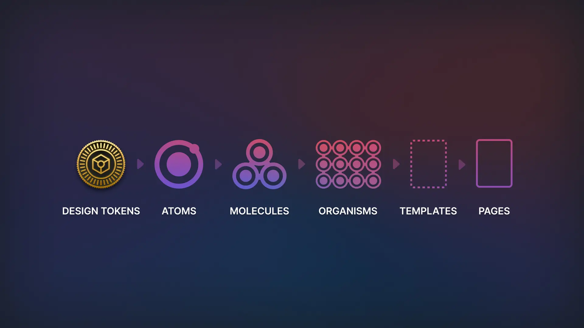
If you are familiar with the Atomic Design taxonomy, design tokens are what atoms are made of.
Let's breakdown a digital product:
A digital product is composed of features
A feature is composed of interfaces
An interface is composed of components
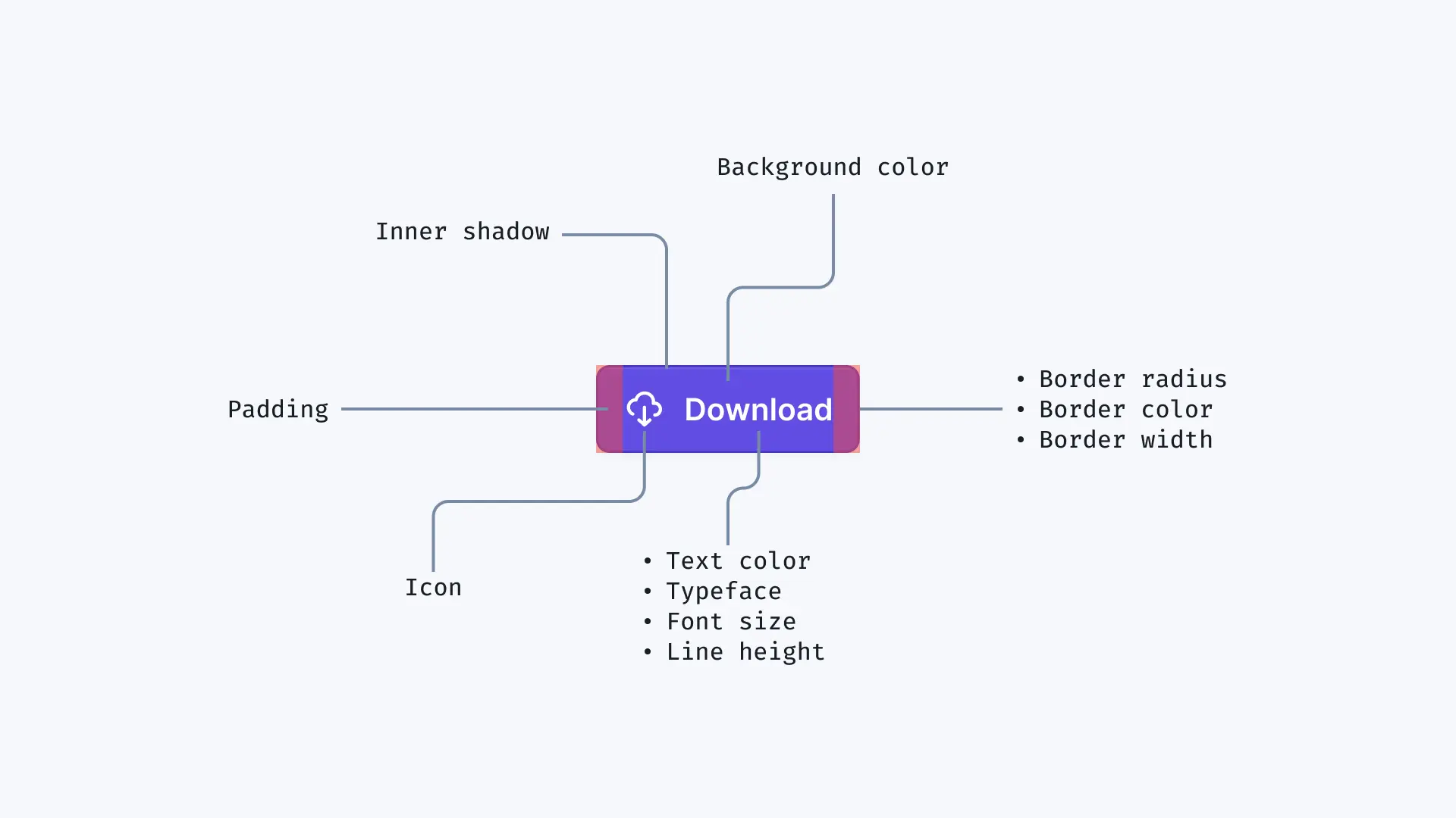
A component is composed of design tokens

The anatomy of a button component showing every design tokens composing it.
At Specify, our primary brand color is called purple "app-base-violet" and its value is #624de3.
Here is the anatomy of our primary brand color:
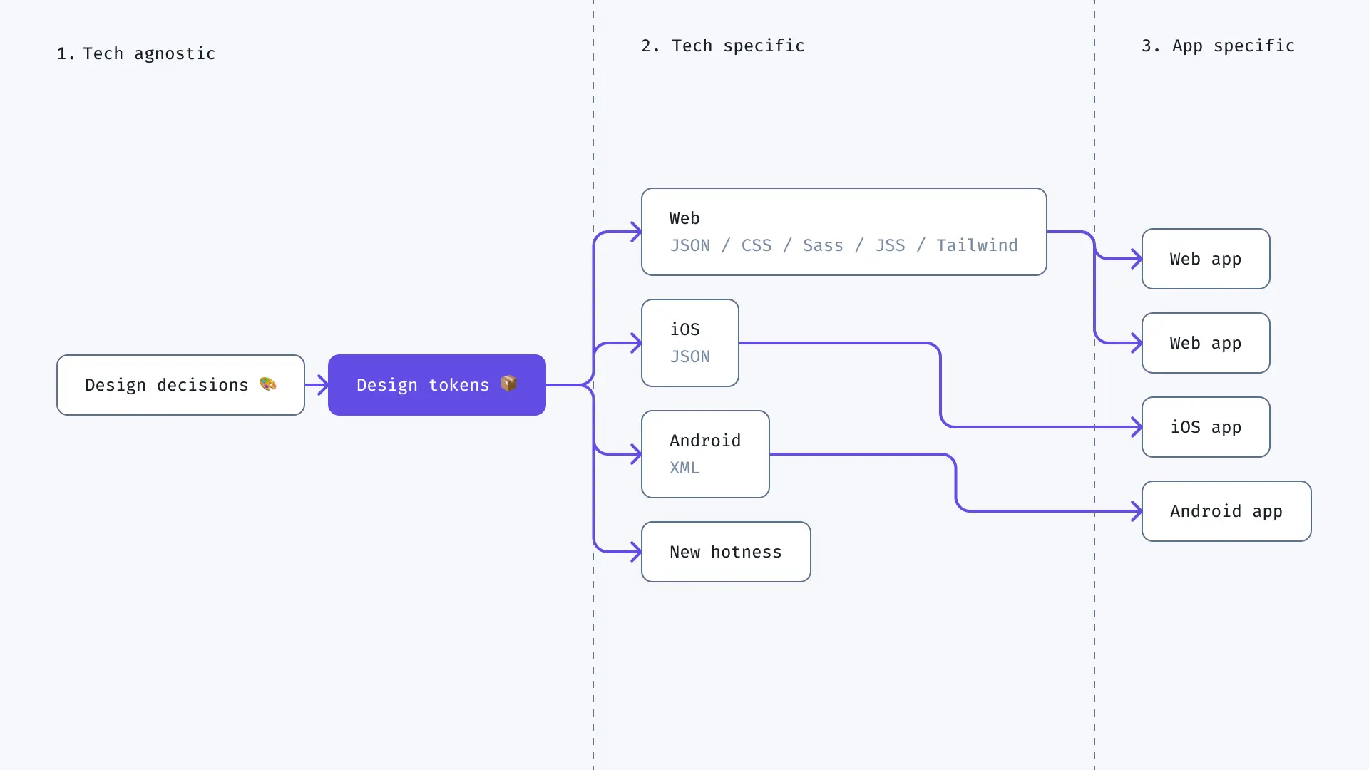
This color can be transformed and formatted to meet the needs of any platform: Android, iOS, Web, etc…

How design decisions are transformed in design tokens to be used in specific platforms.
Design tokens can be stored in code. This makes them only as powerful as the engineers enable them to be. Remember that design tokens are meant to be used across your design system and products. To do so, you will have to transform them so they can be used by many different teams.
By using design tokens you secure your organisation's branding and ease its management.
Design tokens help you reach:
Unique source of truth for your branding
Better translation from design to development
Design consistency across any product UI
Improved management of your design system
Easier management of themes and white-labelling features
Proper methodology to collaborate between teams
For designers
Use design tokens if:
You are tired of seeing that design is sacrificed because developers don't or fail to correctly implement your work
You want the power to handle a design decision from its definition to its deployment
You want every part of the app interface and all the elements to have the same look and feel
For developers
Use design tokens if:
You want to spend more time working on valuable business features and not manually updating design tokens values
You want to improve your experience when using and refactoring your styles
You want to use dark/light themes and/or multi brand products
For managers
Use design tokens if:
You're tired of seeing tickets about styling bugs stacking up
You want designers and developers to find a common ground and collaborate seamlessly
You need to ease the scaling of your teams
Conclusion
Design tokens allow product teams to better collaborate and ensure brand consistency across any platform.
This is truly an exciting time to be designing and building consistent UIs at scale. Design tokens are here to last. Our ecosystem is embracing them and so should you. Let's make styling fun again. Together.
Thanks for reading ✌️
Footnotes & References
This story is inspired by Hiro Matsui who did a great video explaining design tokens ↩
DL Insights - 33 - The evolution of design systems into a Design API with Matthew Ström ↩
